A. D. Alcorcón is a professional football club that has come to be known as Alcorconazo: basically due to having knocked Real Madrid out of the King’s Cup in 2009. Ever since, with greater or lesser fortune, the club has professionalised and fought its way up to La Primera División. A journey on which we have accompanied them, helping them professionalize as a brand, define their Big Idea and modernise their brand and graphic image.
The challenge
Over recent years, A. D. Alcorcón has made tremendous progress in the sporting sense. As the club professionalized it the emotional link it had with its supporters was something they wanted to enhance. They felt the club had to make the most of its character and feeling of proximity. Plus, it had to appeal to the youth, the new generation of supporters.
The strategy
We held interviews to see how the different publics saw the position of the club. At the same time, we studied the branding trends in the Spanish Football League, as well as others such as the Bundesliga or NBA. We defined the DNA of A.D.A. for the future, and the strategy required to appeal both to the developing young and old loyal fans of the club.
The result
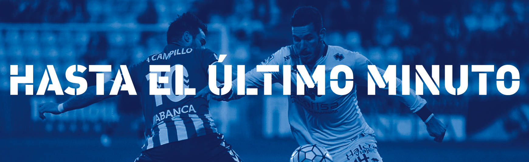
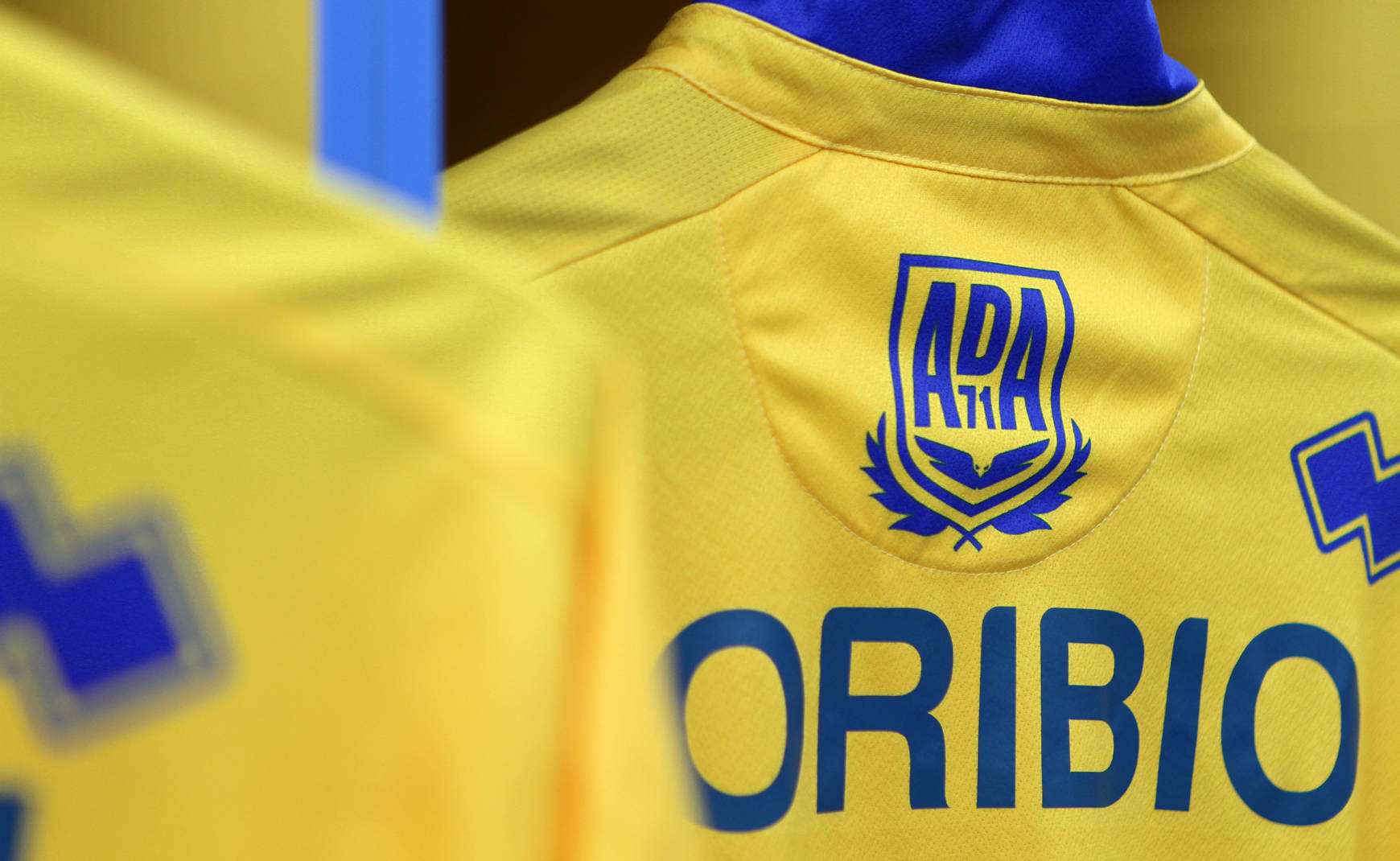
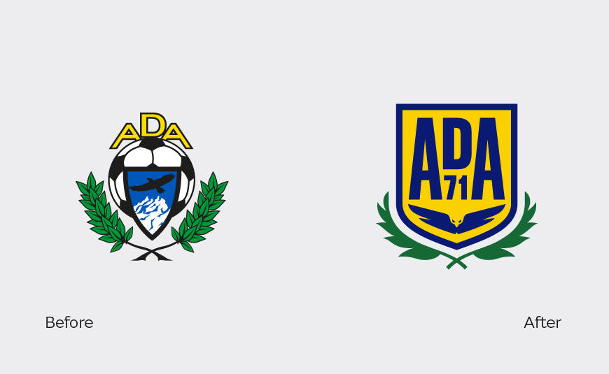
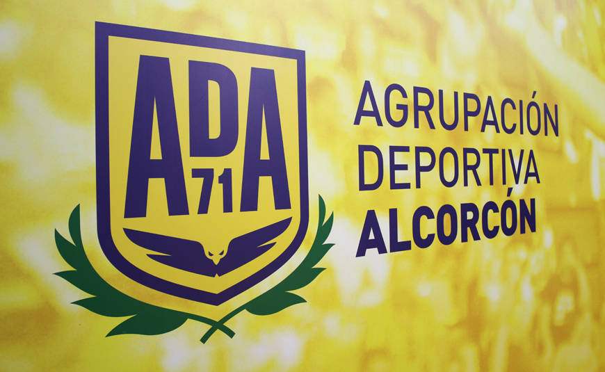
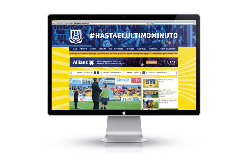
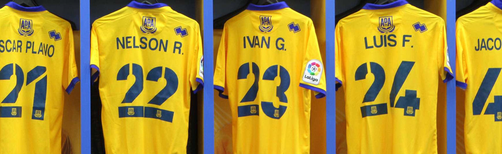
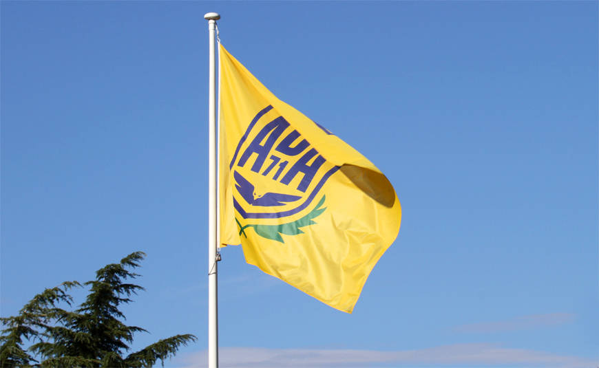
We simplified the club crest, leaving those elements considered essential, to create a solid symbol that would serve both as crest and trademark. We developed a dynamic, versatile graphic system, inspired by the trajectory of the ball when shooting at goal, extending the identity of the club beyond the imagery of the crest. What stands out photographically speaking is the people placed in heroic poses and the colours.

The branding of a modern, people-friendly club.