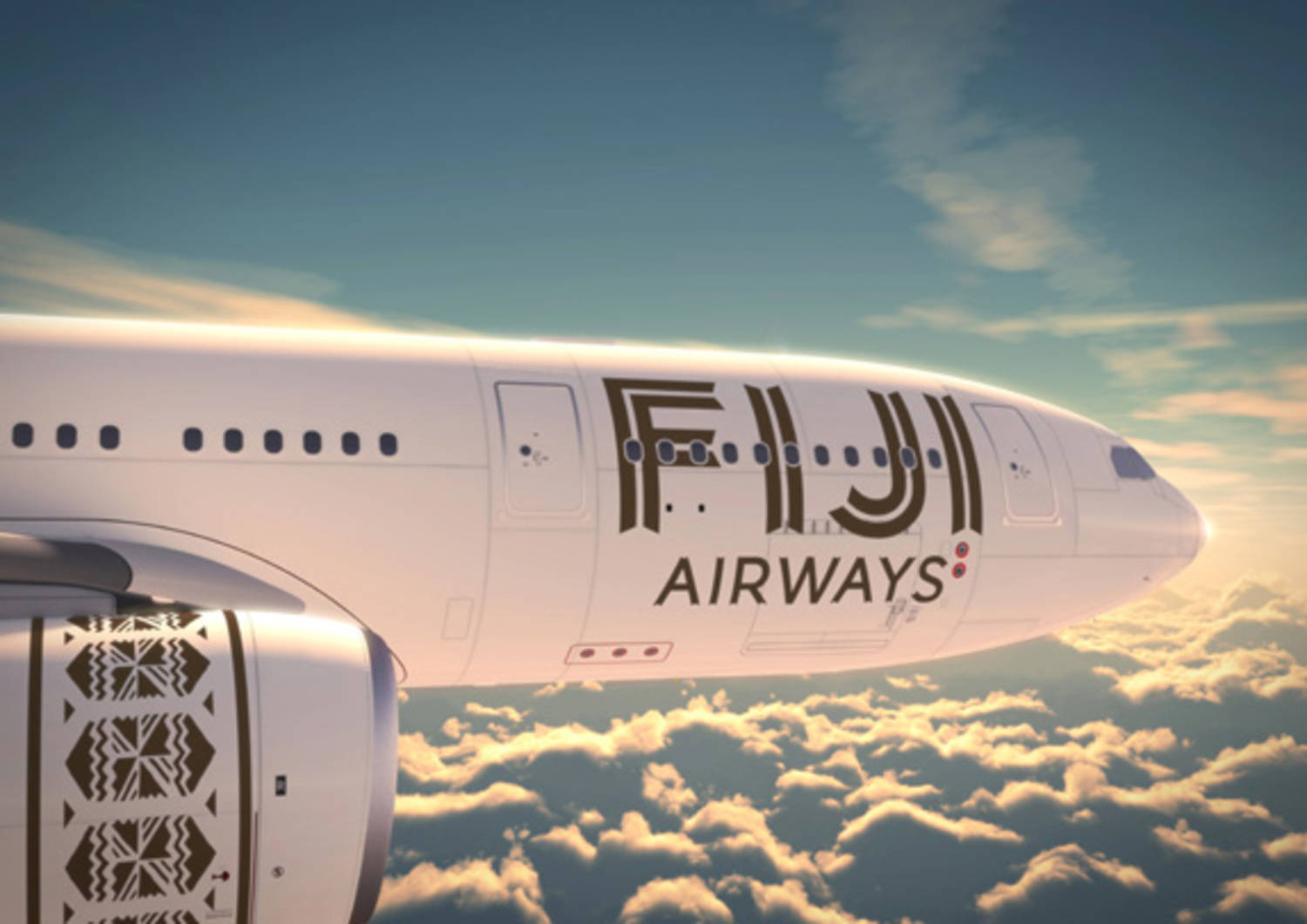
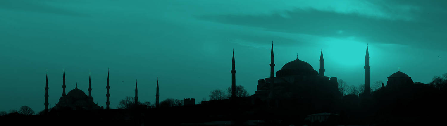
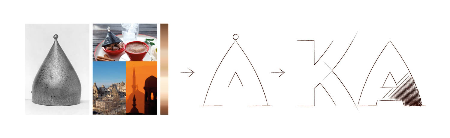
Although it is true that since the days of Atatürk, Turkey has progressively transitioned towards western culture, its Islamic heritage, the Mosques, markets, trade systems and customs, has, without a doubt, remained an important key to the identity of both the country, and its inhabitants. So, when Arzum turned to us to create a new brand which would convey the spirit of Turkey, it was clear that it was there we had to seek inspiration and create a typeface that was simple but at the same time, brimming over with nuances.
A culture in a brand
When Arzum Okka offered us the opportunity to create a brand which was to bring together the culture of the present, past and future, we felt duty bound to take this as our inspiration and develop a typeface.
The process by which cultural imagery is encapsulated in a brand is one most particularly to be found in city branding projects. In such cases, the logotypes and symbols are powerful instigators of positive associations with a particular place or region. They are visual elements that directly evoke a series of positive ideas or emotions around a city or place. Not only do they generate interest from people outside of the city or place, they also create a feeling of belonging and cohesion amongst local inhabitants. Ultimately, their purpose is to aid the economic growth of a place through tourism and investment.
The greatest conceptual complexity of such projects derives from the fact that it is not merely a question of conveying the vision of an individual or team, but one has to synthesise the desires, idiosyncrasies and values of millions of people, and express them in a way which is relevant and aspirational to both locals and outsiders.
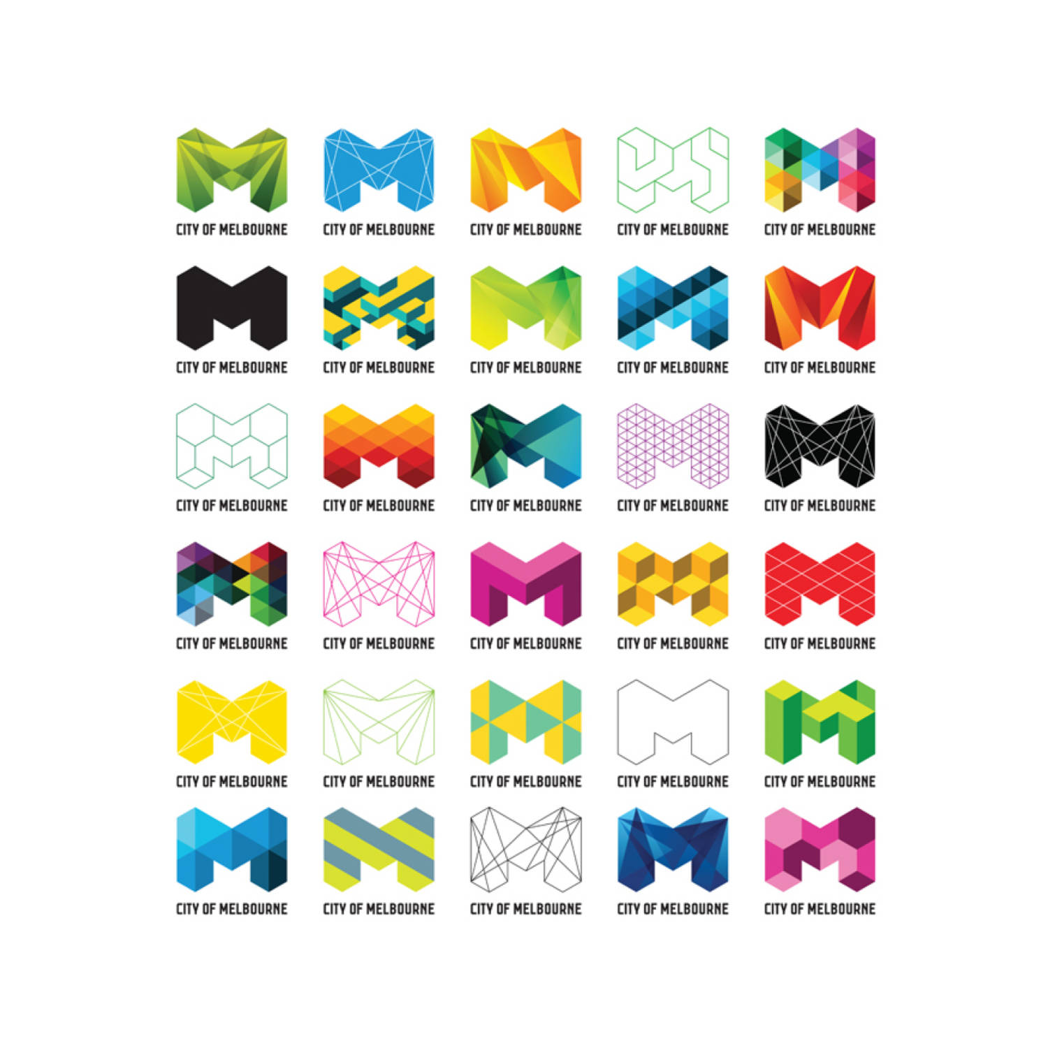
For example, the new identity of Melbourne encapsulates the innovative drive of its inhabitants and the many faces of the city, while also conveying its spirit as a vibrant, visionary and passionate city.
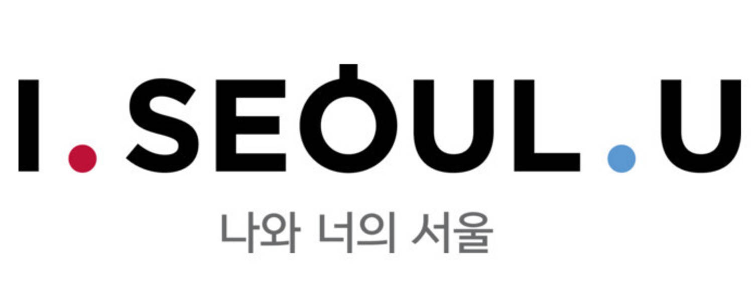
Seoul is another case in point. The typeface itself conveys the great plurality of the culture. The idea of changing the “O” for a Hangul (Korean alphabet) letter was to convey the way the city is home to both east and west, while the I and U represent the coexistence of peoples. Lastly, the two dots represent the coexistence of passion (red) and relaxation (blue). Branding in which the nuances of the typeface are designed to clearly convey a Big Idea.
However, it is an exercise that is not exclusive to Turkish Coffee Coffeemakers or City Marketing, but is indeed a key element in the branding of any product or service that has to integrate or evoke cultural or historical imagery.