From FMCG to artesanal products, from cultural projects to NGOs, from cosmetics to alcoholic drinks, Batllegroup’s 30-year journey in the world of branding and packaging perfectly mirrors the evolution of these two disciplines and how they have evolved from functional design to an all-round brand concept.
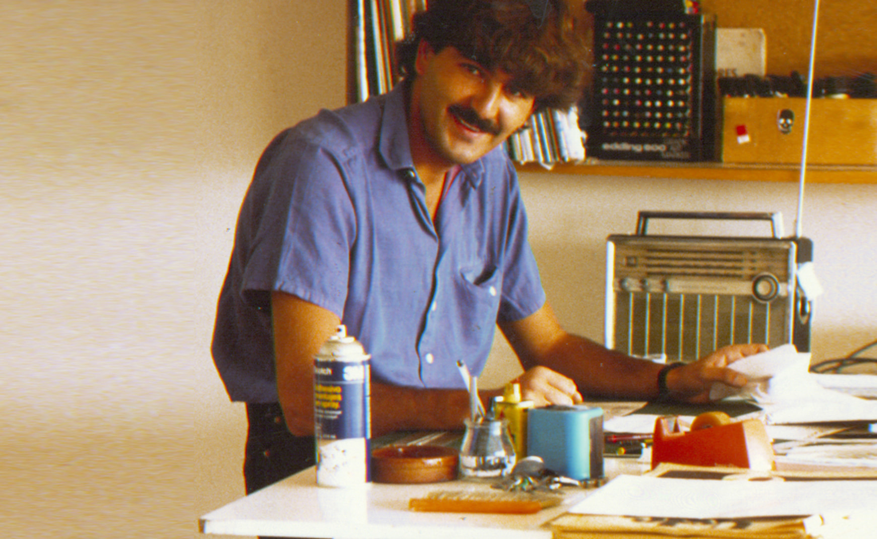
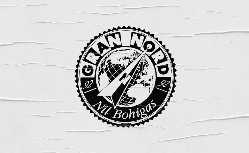
1992 GRAND NORD
One of our first projects was the creation of a logo for the North Pole solo expedition of Nil Bohigas, the first Spaniard ever to achieve this goal. We used a completely manual technique, as it used back then for this kind of assignments. We used tools like letterset, enlarger, Rotring compass and cutter. Always well sharped!
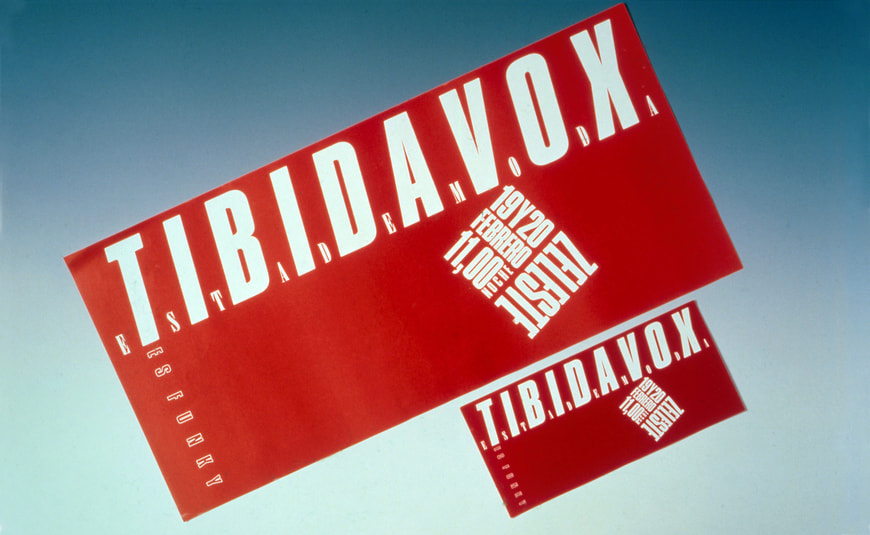
1993 TIBIDAVOX
We designed a poster using only the typefaces of the last remaining sheet of Letraset in our Studio. From the very first sketch to the final print without any additional support.
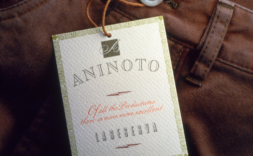
1994 ANINOTO
In the Nineties Aninoto was an iconic fashion brand in Catalunya: they introduced a more casual and relaxed style that was talking to a new target consumer. We created for them a new logo, which embodied these new trends, and we did it entirely by hand, using felt-tip pens, airbrushes and crayons… as the digital era was not there yet.
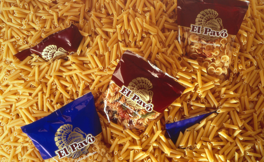
1995 EL PAVO
We brought to life their new brand logo, with an outstanding and recognisable symbol and typeface. We produced high-quality packaging across their entire fresh pasta range and their products became indispensable treats during the Christmas season.
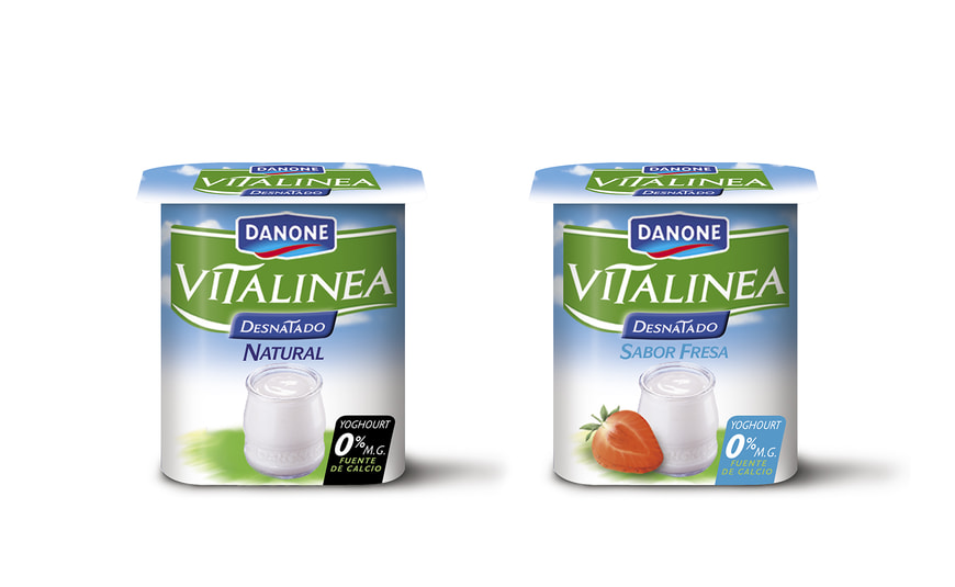
1996 VITALINEA
The quintessential yoghourt from the famous campaign “Los Cuerpos Danone”, the skimmed yoghourts range that gained popularity and became a self-standing brand: Vitalinea. We created the brand itself: a brand with personality and its own specific color code, ownable and standing out on shelf. And Cindy Crawford was its face.
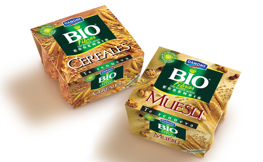
1997 BIOFIBRAS
Danone empieza a introducir en el mercado los yogures hechos con muesli y cereales. Ideamos una imagen propia que marcó la tendencia en esta categoría con el uso de una fotografia que mostraba bodegones reales hechos con tierra y espigas. Fue una innovación que todavía es vigente y que marcará un antes y un después en cómo enseñar las fibras de una manera natural y realista.
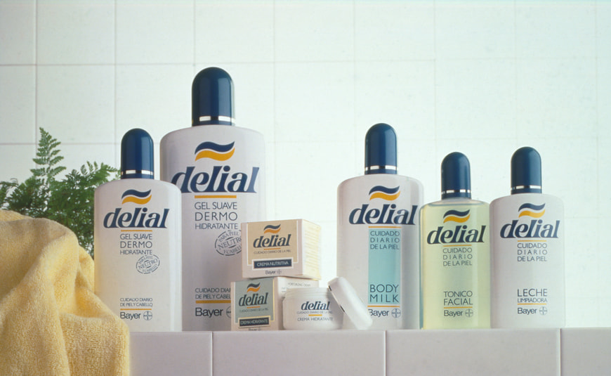
1998 DELIAL
Who doesn’t know about Delial sunscreens? Well, back then they decided to extend their products portfolio by launching a new dermocosmetics range. So we conceived an innovative pack structure, and developed branding and packaging design around it. The result was a clean, strong design, enriched by a soft palette, which mirrored the idea of daily skincare.
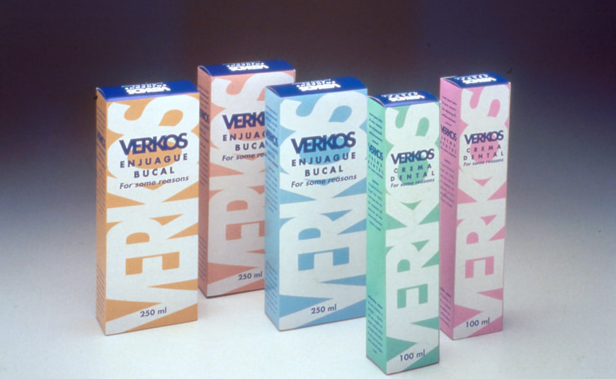
1999 KEMPHOR
Back then the toothpastes brand Kemphor dared to take a revolutionary step: move away from pharmaceutical distribution and leap into FMCG. They trusted us to refresh their whole range and the result was a bold and colorful typeface design, a winning creative challenge for their own brand.
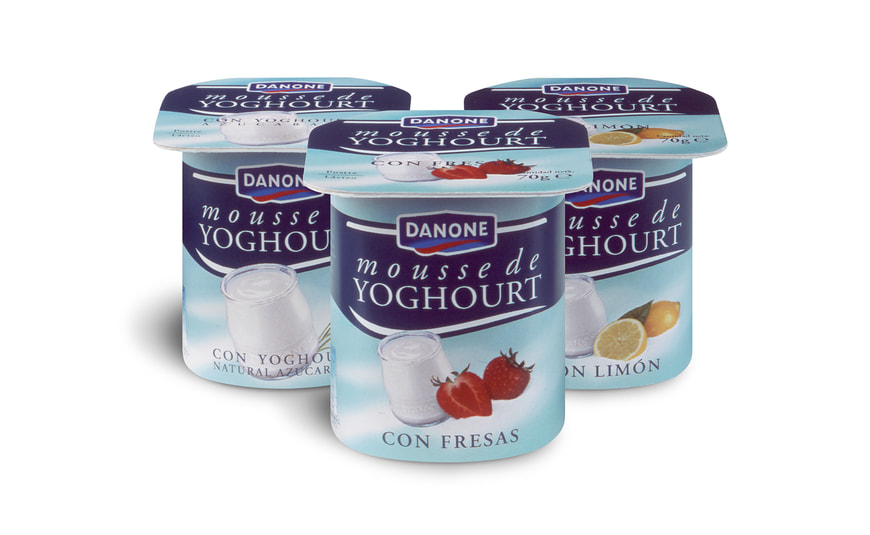
2000 MOUSSE DE YOGHOURT
Once again, Danone led the category by launching an innovative product on the market: the yoghourt mousse, or - as the brand itself would describe it - “the yoghourt of the next century”. We created a simple and clean design. The background color mirrored the softness of the product. With a simple and elegant turquoise ribbon wrapping the entire pack and an English-style typography, we conveyed a unique personality to this new product. Deliciously soft, pure poetry!
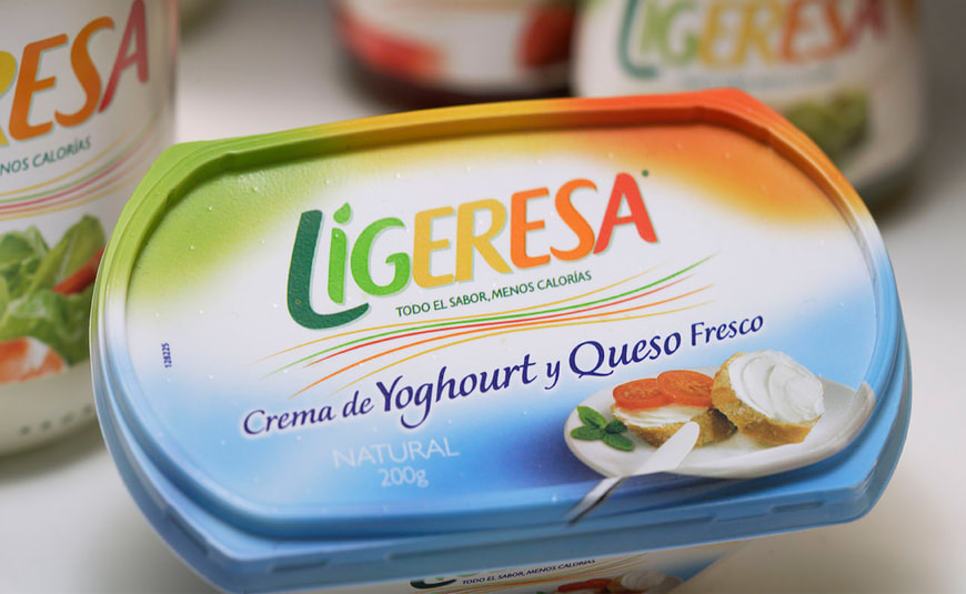
2001 LIGERESA
This light mayonnaise brand was extending its portfolio, so we adapted their distinctive and unmistakable brand mark - the colorful diagonal lines - into their new products. The original design seemed a little bit cold and distant so we updated it by providing a more fluid and dynamic movement that we also moved into the logo making the lines less relevant. Simple, easy and a real success.
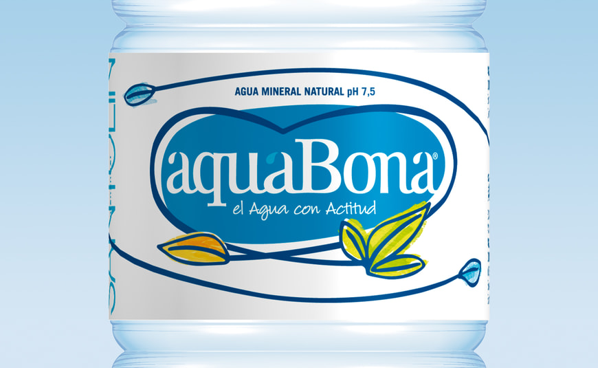
2002 AQUABONA
The design refresh we did for this popular brand of water is one of our favorites! The challenge was that their brand was going unnoticed on shelf. We accepted the challenge and leveraged and highlighted their characteristic branch-like pattern of lines, playfully reshaping it into a heart. Moreover, the new logo included the organic shape of a blue drop of water, which conveyed more strength to the brand .
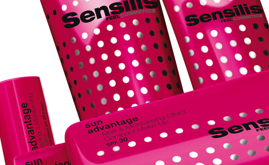
2003 SENSILIS SUNCARE
Sensilis revolutionized the SPF category by bravely replacing the typical sunscreen orange color with a feminine and eye-catching magenta and a pattern of silver dots. A very disruptive step in terms of category codes. Striking!
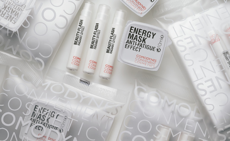
2004 COMODYNES · LaSal Comunicación
We reinvented pharmaceutical cosmetics to make it more approachable, affordable and easier. We played with typefaces and introduced smaller containers that usually belonged to other categories; the result was a very modern and appealing range of products that everyone would like to have in their bag.
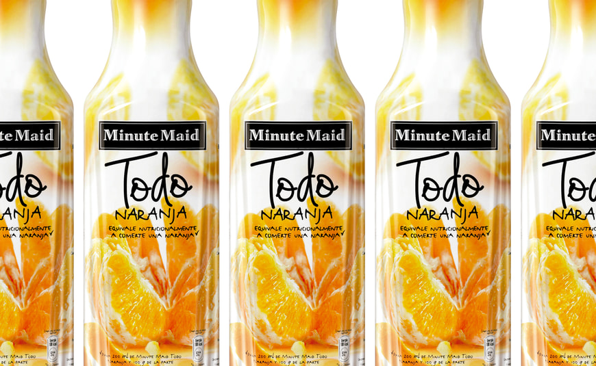
2005 MINUTE MAID NARANJA
What’s the best way to make a freshly squeezed orange look natural and yummy on pack? By breaking the category codes, and making the orange feel so real and palpable that you have the impression of eating it and drinking it straightaway.
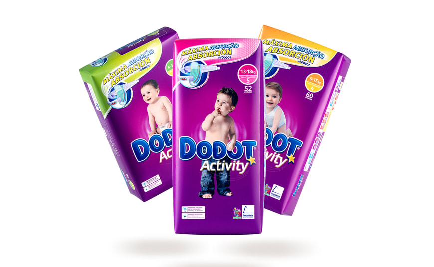
2006 DODOT
Baby products always use the same ‘language’ and visual codes: all soft, delicate and - admittedly - a bit cheesy. Our goal was to break these codes and convey quality and innovation by redesigning logo and typography, giving it a more “technological” look&feel. Moreover, we stepped away from the traditional pastel colors and dared to give the packs a dark magenta background in order to make this nappies range more modern and unique. The photo shooting sessions with the screaming babies are a different story…
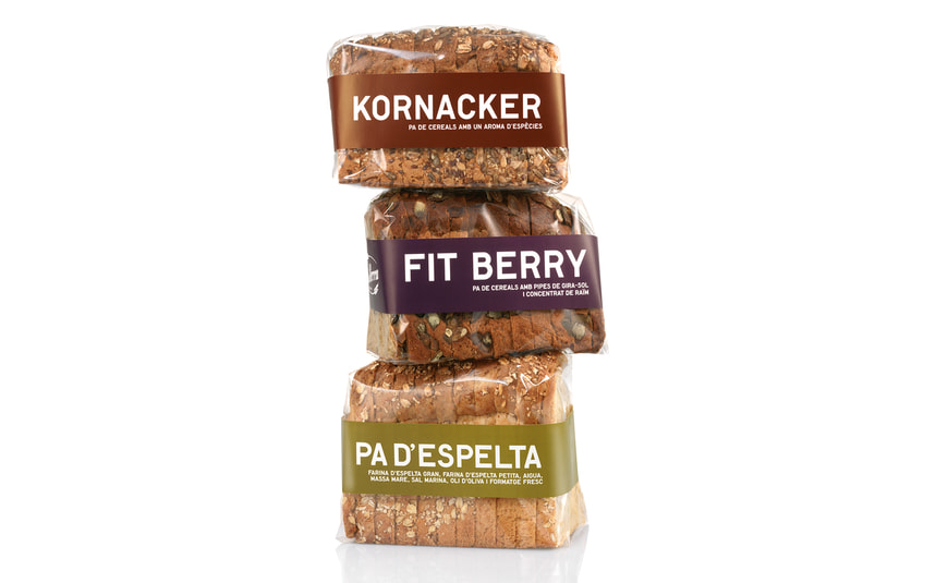
2007 PA SERRA
This is an artisanal product, made in one of the most iconic bakeries in Barcelona: a family business with limited budget, so the brief was to create something easy and reasonable in terms of production. The product spoke for itself, so we highlighted it with transparent wrapping and colorful ribbons (for the variant differentiation) - the final touch was a distinct and punchy typeface. Hot off the oven!
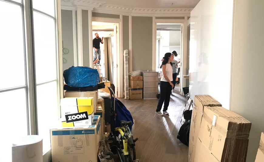
2008 NOS MUDAMOS
Our Studio on the Rambla started feeling too small. After much searching, we found a perfect location in the heart of Paseo de Gracia… 300m2 to give space to our creativity in the years to come…
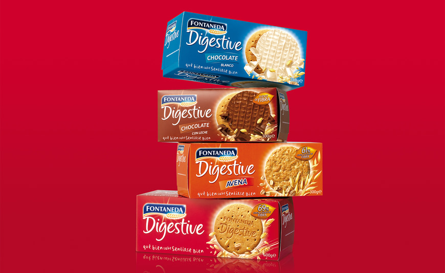
2009 DIGESTIVE
We did it! We shook the world of cereals with the redesign of Digestive cookies. Thanks to a new FOP architecture, we created a very recognizable branding, with stark and ownable colors that helped identifying and differentiating the range of products. The key visuals with the moving wheat spikes conveyed a dynamic and natural look&feel.
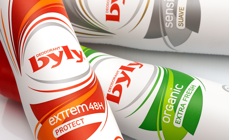
2010 BYLY
The deodorants brand Byly wanted to take a big leap and enter FMCG with a completely new look. The starting point was a blank canvas: a naked container with barely any feature. We injected it with vibrant colors and gave it an organic shape to elevate Byly where it belongs: among the best deo brands around.
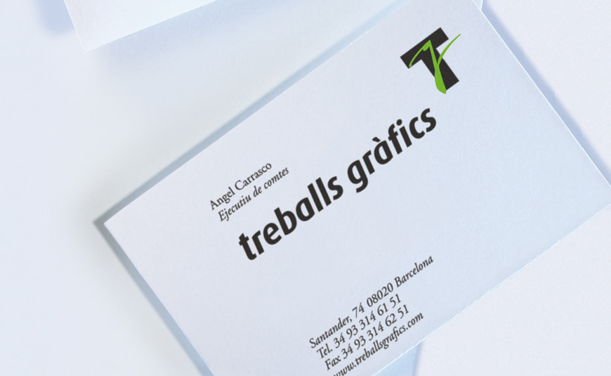
2011 TREBALLS GRAFICS
We created a new identity for one of the leading printing companies in Barcelona. We started from a typeface created by the famous designer Javier Mariscal and integrated it with a new element: a clear and distinctive T letter, which represented the technical expertise of the new brand.
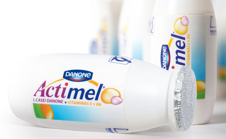
2012 ACTIMEL
We worked on the rebranding of Actimel, the quintessential liquid yoghurts brand. We designed the icons of LCasei and vitamins E and B6, and developed a brand block that included the logo and these new icons: an innovative brand asset that made the product memorable and immediately recognisable.
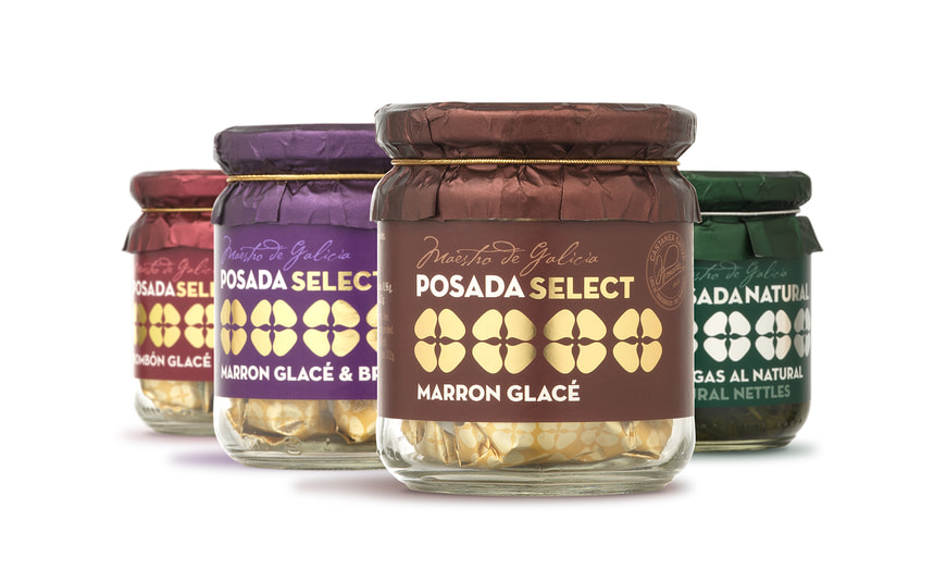
2013 POSADA
Posada is a Galician brand of gourmet products. Back then, their branding did not live up to their delicacies. We rebranded and restructured the entire portfolio architecture of their star products: Marrón Glacê, a range of sweets made with chestnuts. We leveraged a chestnut illustration and turned it into an iconic visual, which became the main asset of their new brand identity. We placed this on a neutral, elegant background, with touches of gold and silver, and the result was premium branding for premium products.
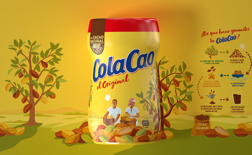
2014 COLA CAO
Since 2007, Batllegroup has been responsible of the brand identity of Colacao, a true Love Brand with 75 years of history. In 2014 we redesigned the pack in which the brand's surrounding storytelling told the story of ColaCao, from the cocoa tree to its consumption. Every detail counts when you have to rethink Cola Cao without losing emotional ties.
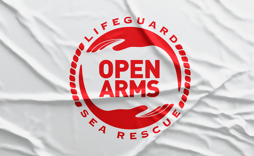
2015 OPEN ARMS
One of the projects we are most proud of from Batllegroup is the creation of the logo for OpenArms. We created a distinctive brand that was recognizable from anywhere in the world. A few arms embrace the logo, resulting in a simple but forceful and unforgettable stamp. "Because we save lives and that's what the brand says," Oscar Camps said.
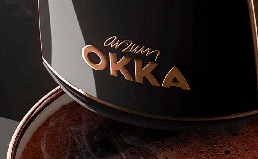
2016 OKKA
Arzum contacted us to help them position an instant Turkish coffee maker in the premium segment with a new brand: Okka. Together with Stimulo we design a coffee maker that is a sculpture to Turkish delights, as well as working on branding and communication with innovative co-creation processes.
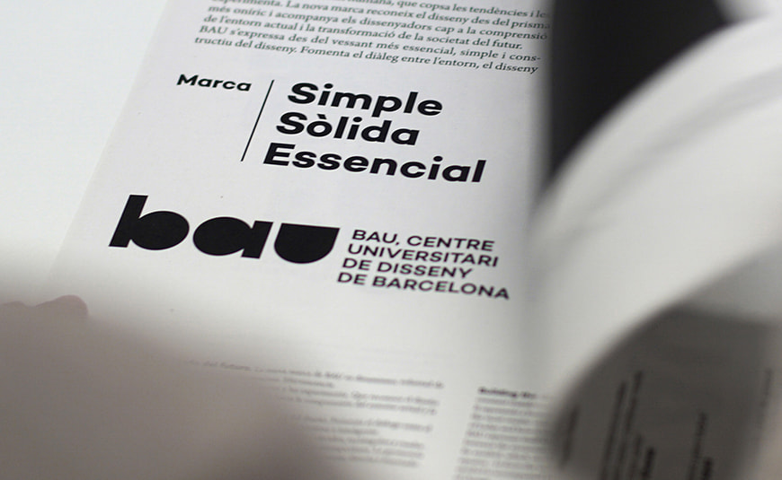
2017 BAU
Very proud of this third rebranding for the Design School that we founded. We ditched the “eye” icon” as a main hallmark to replace it for a visual identity based on geometrical shapes in black and white. Simple, powerful and memorable.
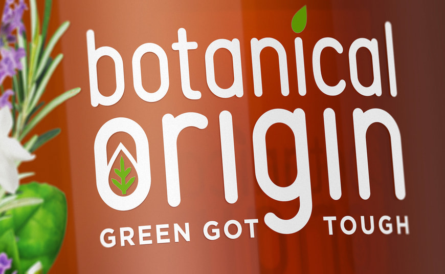
2018 BOTANICAL ORIGIN
Reckitt Benckiser set up a meeting with us to take on a project where sustainability was the real backbone and the challenge of this new launch: a detergent made with natural ingredients. The concept “the power of nature” inspired us to create from the pack shapes of those containers along with Stimulo, to also the brand and packaging design, succeeding at changing the perception of effectiveness for eco products.
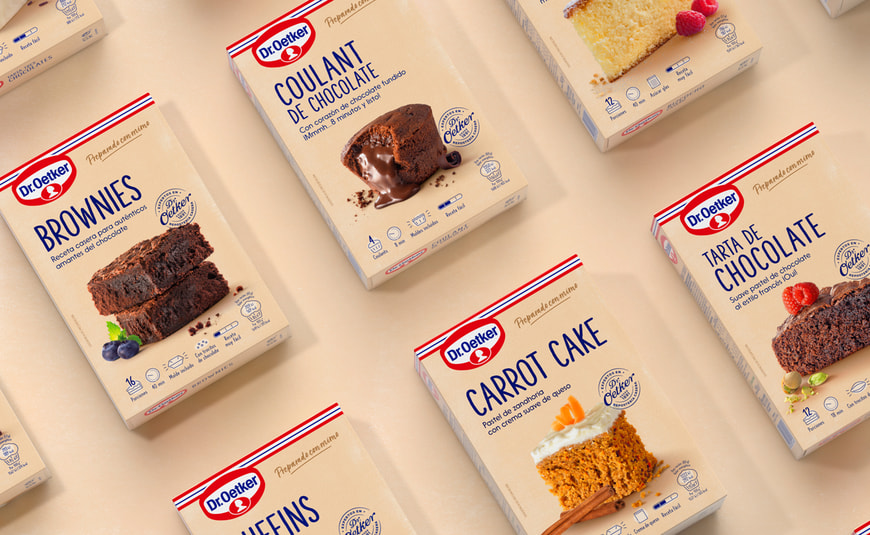
2019 DR. OETKER
Client shared with us the necessity to redesign their packaging to reconnect with the new generation of foodies and to also invite families to rediscover the magic of baking at home. We were delighted to work for a range of products where the key visuals were the protagonists and where the design provided proximity, iconicity and credibility that inspired and stimulated the senses. Because everything started with just one packet of yeast…
2020 LICOR 43
We had a big challenge here: to create a limited edition for Licor43. We paid tribute to the Spanish creativity and craftsmanship, taking as the base line the tiles from the Austrias de Madrid neighborhood. An ornamental and very thoughtful design going from the concept through its meticulous production. The Limited Edition not only traveled around the world, it also received the first award in the Dieline Awards and the bronze in the Pentawards.
2022 GALEA
The Spanish Vineyards contacta con Batllegroup para lanzar al mercado de USA un producto propio: una gama de 5 referencias de sangría. Creamos el naming, el branding y el packaging de estas novedades, así como el look and feel de la web y algunos materiales de punto de venta. Seducimos al consumidor a través de un diseño inspirado en la naturalidad y en la belleza del mediterráneo, en los rayos de sol y la brisa del mar, aportándole un carácter vibrante, optimista y lleno de color.
2022 30 ANNYVERSARI
This 2022 we turn 30 and to celebrate it we have updated our graphic identity. We have created a new graphic universe with live geometric shapes and we have also incorporated a new palette of striking colors that provide freshness without detracting from our identity. In addition, we have created a symbol that will accompany us in every celebration of this 2022. This symbol has been made following a graphic style that refers to the one used in the early 90s, when Batllegroup was founded. Each line that makes it up, symbolizes the fulfillment of a decade.